Scotland
Income inequality trends by percentile for Scotland The figure above shows trends in net household income, by percentile, in Scotland for the period 1999/2000 to 2016. There are several features of note: wide inequalities in income generally, with a particular gap evident between the 90th percentile and the rest; increases in income and widening inequality over time, followed by a fall in income levels across most groups around the time of the recession; and a later increase in income in the last part of the time period shown.
Trends in absolute and relative income inequalities for Scotland The trends in absolute and relative income inequalities (as defined by the difference between, and ratio of, 90th and 10th percentiles, respectively) are shown in the graph above. Despite some fluctuation, absolute inequalities in household income increased over time from a difference of £29,400 between the 10th and 90th percentiles in 1999/00, to £36,500 in 2016. Trends in relative inequalities were fairly flat, the income of the 90th percentile being consistently around four times those of the 10th percentile.
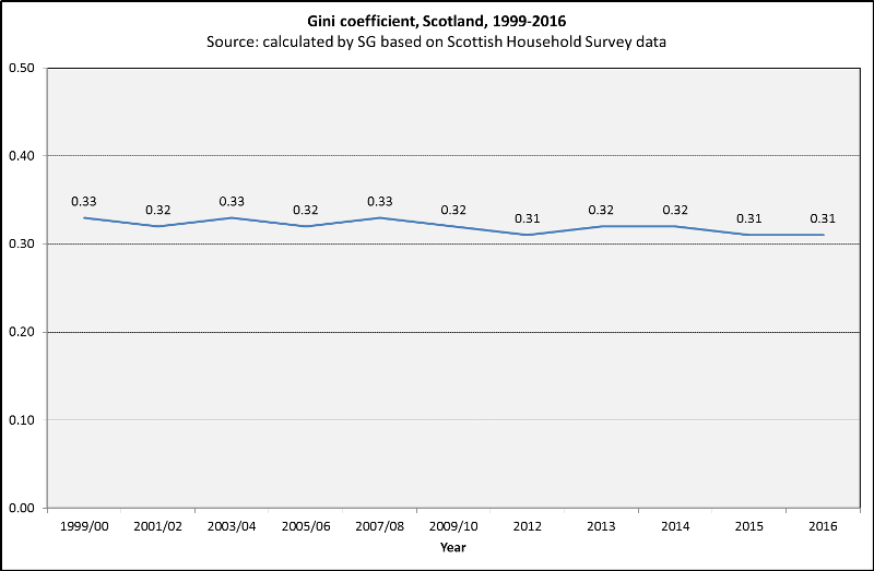
Trends in the Gini coefficient for Scotland
Different and more sophisticated measures of income inequality also suggest there has been little change in levels of inequality over the time period shown. The Gini coefficient measures the dispersion of the whole income distribution (rather than just comparing the extremes) and has a theoretical value ranging from zero (representing complete equality) to one (representing complete inequality). For the data shown here, the Gini in Scotland has fluctuated over time between the values of 0.33 and 0.31.
Trends in the Palma coefficient for Scotland
 Another statistical measure of inequality is shown above: the Palma ratio, which is calculated as the ratio of the richest 10% of the population’s share of income divided by the share of the poorest 40%. The figure above shows year-by-year fluctuation in this measure and overall the trend is fairly flat, albeit the value of the ratio did decrease in the last three years shown (from 1.22 in 2013 to 1.10 in 2016).
Notes
We are aware that the data on this page are several years out of data. We hope to update these data soon.
All data have been adjusted for inflation and are therefore shown in 2016 prices.
The graphs in this section have been derived from a GCPH report - Trends in earnings and income inequalities in Scotland and the UK 1997-2016.
